Product
Member's Dashboard
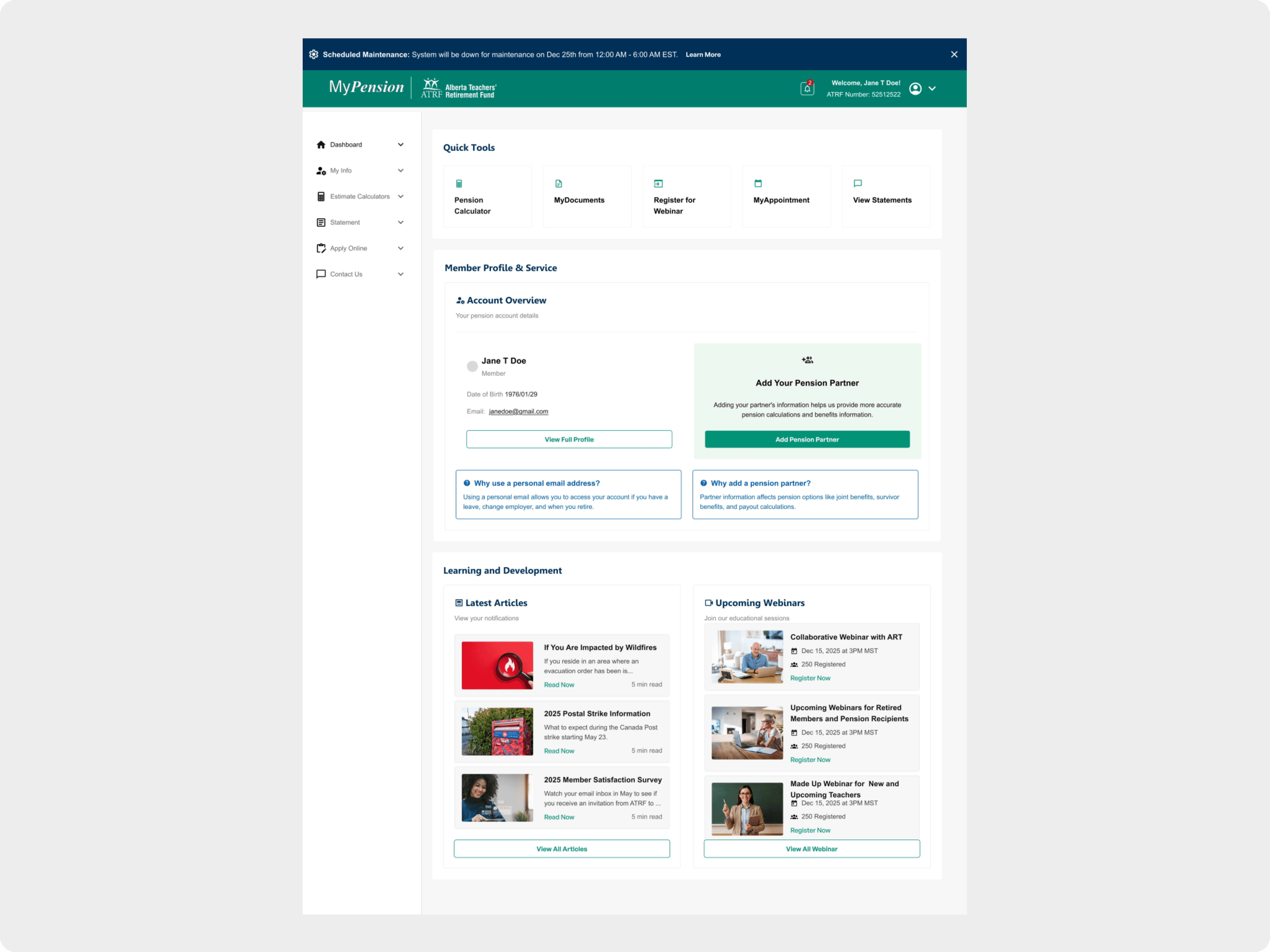
UX redesign of ATRF’s MyPension dashboard, improving task clarity, accessibility, and navigation within a legacy member self-serve portal.
Category
Client
Year

Project overview
As a contract Product Designer for ATRF, I redesigned the MyPension dashboard to help members quickly understand what actions they need to take—such as reviewing beneficiaries, generating pension estimates, or accessing documents—within a legacy system. The updated, task-focused layout modernized the UI while enabling a more self-serve experience using accessible, scalable design patterns.
Problem
The existing dashboard had become cluttered and difficult to navigate, especially for members trying to complete important tasks like managing beneficiary information. Key actions were buried across the portal, navigation was inconsistent, and accessibility standards were not met.
Because the system relied on legacy code and manual support processes, members often struggled to understand:
What actions were available to them
What required attention
Where to go to complete updates without calling support
Approach
Surface critical member actions—such as beneficiary management—directly from the dashboard
Help users quickly understand what they can do next
Improve visual hierarchy and readability within legacy constraints
Meet WCAG 2.1 AA accessibility standards
Establish a scalable UI foundation for future portal updates
Solution
Task-Focused Dashboard Layout
Redesigned the dashboard around modular, card-based sections that highlight key member actions at a glance. Each card surfaces relevant context—such as status, deadlines, or last-updated timestamps—so members can act confidently without digging through multiple pages.
Improved Information Architecture
Reduced redundancy by consolidating links and entry points
Simplified navigation paths to core workflows like beneficiary updates and pension estimates
Prioritized high-impact member tasks over static informational content
Accessibility & Responsiveness
Improved contrast, type hierarchy, focus states, and keyboard navigation
Implemented a flexible grid that adapts cleanly across desktop and mobile
Designed within existing system constraints while ensuring patterns could scale across future modules
Result
Clearer visibility into key member actions, including beneficiary-related tasks
Reduced time-to-task for common workflows
Fewer navigation-related support requests expected as more actions become self-serve
Established a reusable, card-based dashboard pattern for future MyPension enhancements
Learnings
Task-driven layouts help users understand what to do next more effectively than content-heavy dashboards
Designing for accessibility early is critical, especially in legacy systems
Strong information architecture can significantly improve usability even within tight technical constraints


